TLDR
A project that aimed to enhance the usability and aesthetic design of a legacy page in the Capsule UI by adopting modern UI patterns and practices.
A design refresh
The main aims were to aid the readability and understandability of the different metrics and account details that an account owner or admin might typically need to manage. These include but are not limited to payment information, billing details and account quota information.
The design needed to support showing the information above at the highest possible level of clarity and readability. Errors or misunderstanding areas of this UI could be highly problematic.
Exploring new UI patterns in Capsule also provided more opportunities to explore new ways to upsell features to lower-pricing-tier customers.
Heuristic Analysis
In order to identify what to improve for a redesign, a Heuristic analysis was performed by myself. The findings of this led to some immediate design modifications which improved the overall user experience of this page.

Key Design Issues
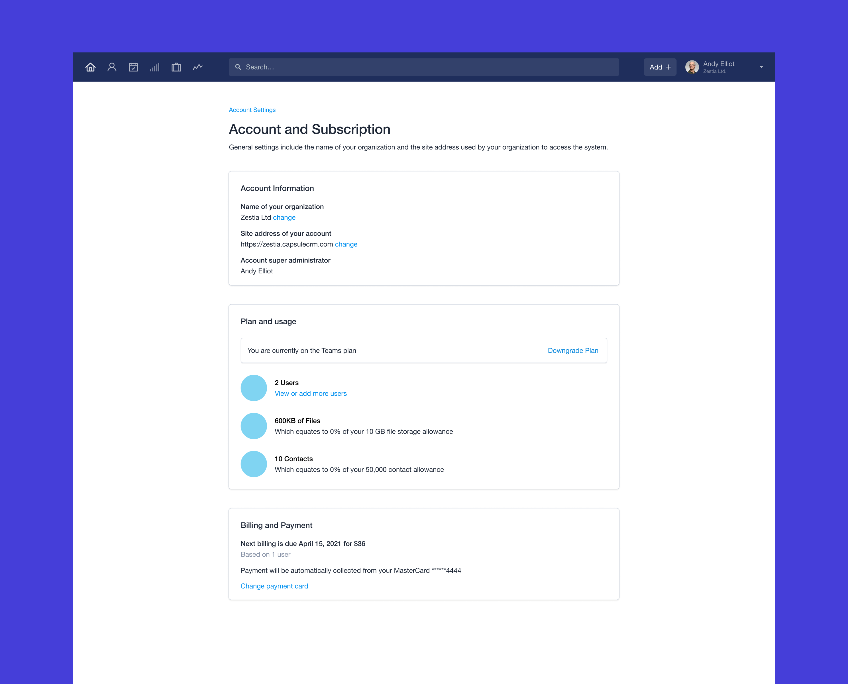
- Account information is clear but there are opportunities to explore alternative UI patterns to increase visual interest, engagement and reduce the amount of screen real-estate used to display the information.
- Pie-charts are a great way to display data in a visual narrative. However, alternative patterns can be explored in order to make the data more understandable and cognitive biases can be explored as a potential upsell opportunity.
- Visual hierarchy and emphasis could be revised to make more important information like the next billing period more prominent in the UI.
- There are general opportunities to reduce the amount of information in the UI, in some cases verbose language is used where the UI could simplify the design.

Key Design Improvements
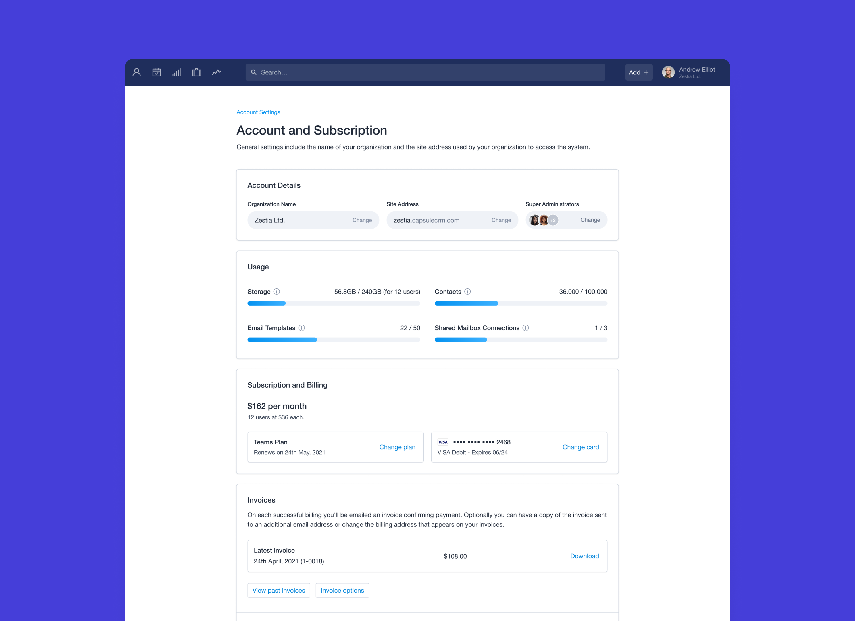
- Account details continue to share a common region but use an refreshed UI pattern to contain, display and edit information.
- Account quota's are visually represented as progress bars now as a strong visual anchor and makes the information more immediately understandable. In addition this could encourage account upgrades due to the effect of 'loss aversion'.
- All subscription and billing details share a common region and the most important information is given higher visual emphasis over other details.
- Interactive content component blocks help visual grouping, grouping meaning and aids in information scanning by the user.