
TLDR
A Qualitative research-led project that identified a high rate of abandonment on a particular page that was driven by a confusing and error-prone user experience. I used posthog as a tool to monitor user sessions, identified the problem, designed a series of fixes and successfully released the solution.
Introduction
Releasing incremental changes quickly was integral to Byway's working methodology, identifying and releasing small changes, monitoring their success through various means and restarting the cycle was a weekly task for myself and the rest of the team.
Below represents one such cycle which saw me identify a problem and release a fix following live behaviour analysis.
I introduced Posthog into Byway's toolkit to monitor usability. I noticed an unusually high number of 'Rage clicks' on the 'Book' button and investigated further.
Identifying Bottlenecks
Before I could focus on identifying specific customer issues during their journey through Byway, I first needed to understand the journey they take through Byway.
I produced customer Journey maps which helped with a number of things. First it identified and standardised communication between teams, we could refer to steps in the customer journey in a language that was consistent across the organisation. Second, it accurately segmented the user experience which could focus effort in information gathering.
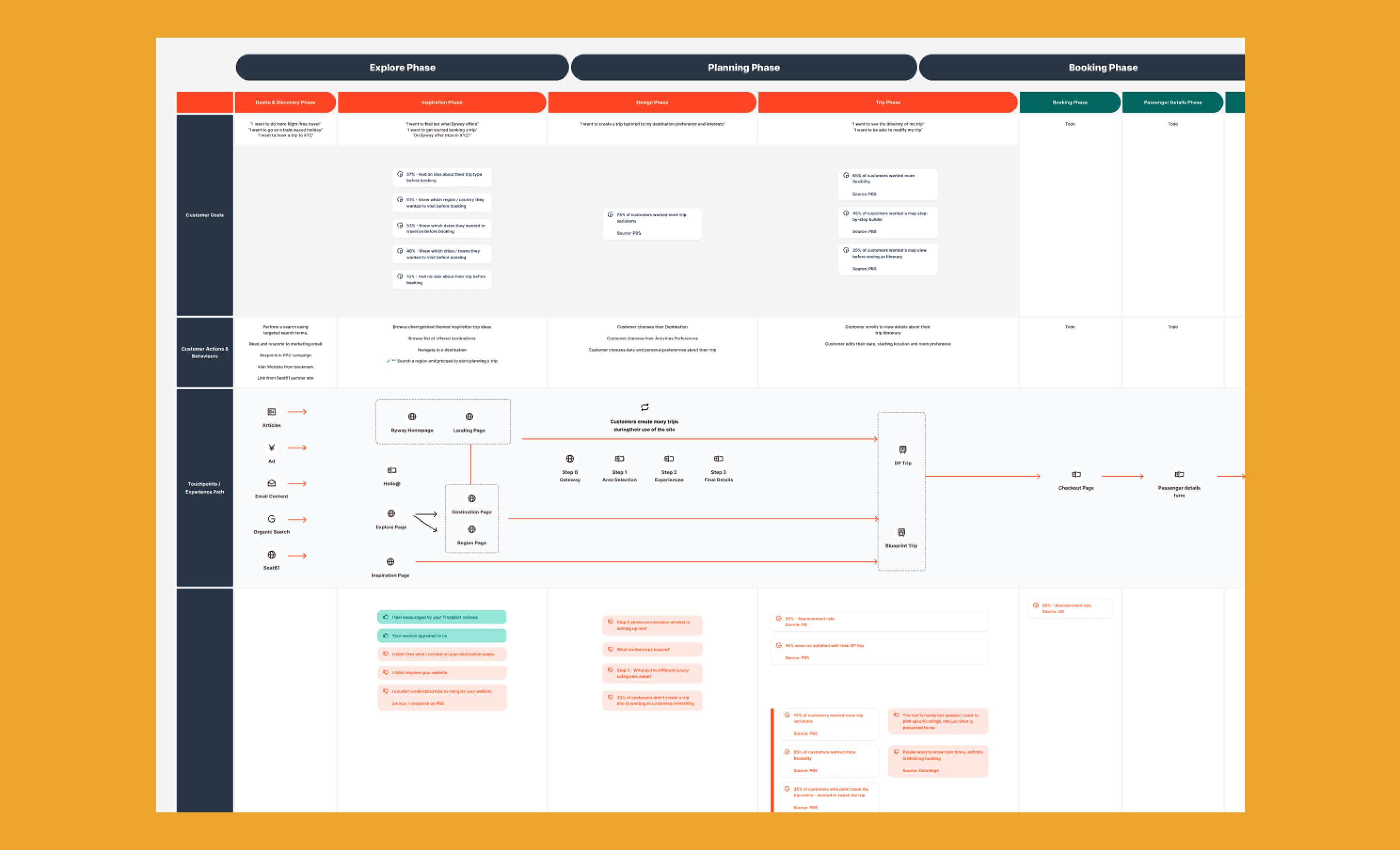
During this exercise, I could identify the quantitative data using Google Analytics that supported the theory that there was a bottleneck in the customer journey, which further exacerbated a drop in conversion. I wanted to investigate why there was a 95% Abandonment Rate on the trip summary page.
Whilst there were many other qualitative and quantative sources that suggested a mismatch between the customers expectations and what was offered on this page, there was still an opportunity to ensure there were no usability issues contributing towards this drop in conversion. I used Post Hog as the tools of choice to gather this data.
The Problem
After utilising Post Hog to explore the customers experience on both Mobile and Desktop on a per-session basis, I identified a significant usability issue.
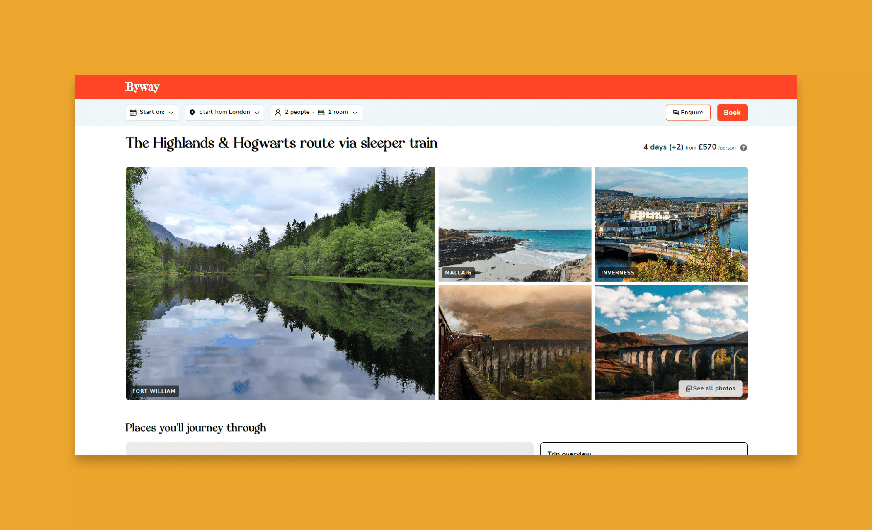
Below represents a screenshot of the desktop view of a typical trip summary page at the time.
The User Flow
Below represents the user flow behaviour that was observed using Posthog. This was a useful exercise in order to isolate the customers path through this particular part of their user journey and to identify a possible path of least resistance.

Stuck in a loop
Customers were simply getting stuck into a loop, they would either not enter a date and click book, only for the system to error without them knowing or enter a date that was not bookable, clicking book again and get into the same situation.
The book button served two purposes, first, to check if the customers selected details were valid, and second to navigate the customers through to the booking page. I needed to find a solution to get any error message in front of the customer so they could rectify the problem themselves. There were other improvements that were also released at the same time which further improved the customer experience.
The Solution
The solution was first theorised in the user flow diagram by describing automatic system behaviours to help the customer smoothly on their way to the booking page.

Design Improvements
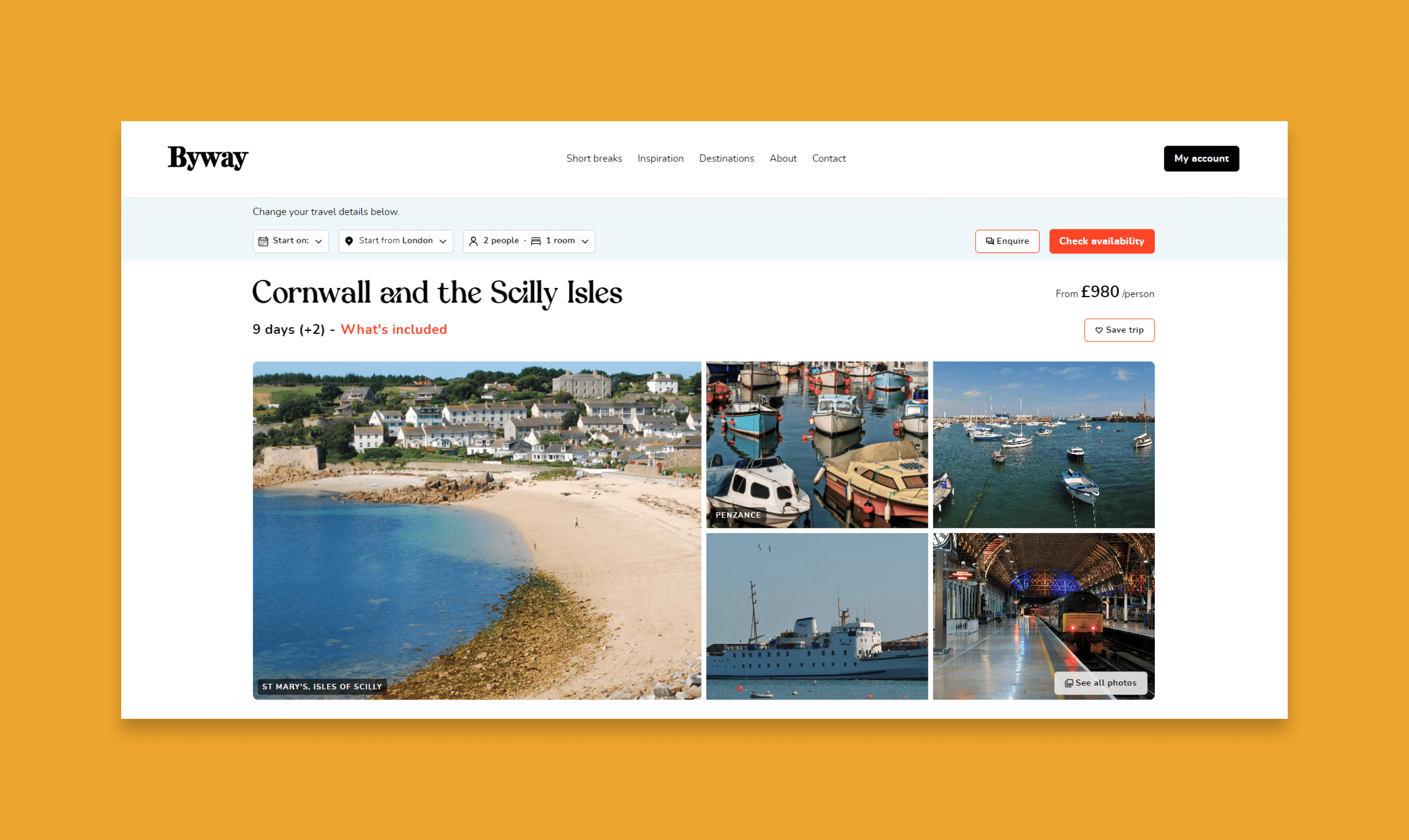
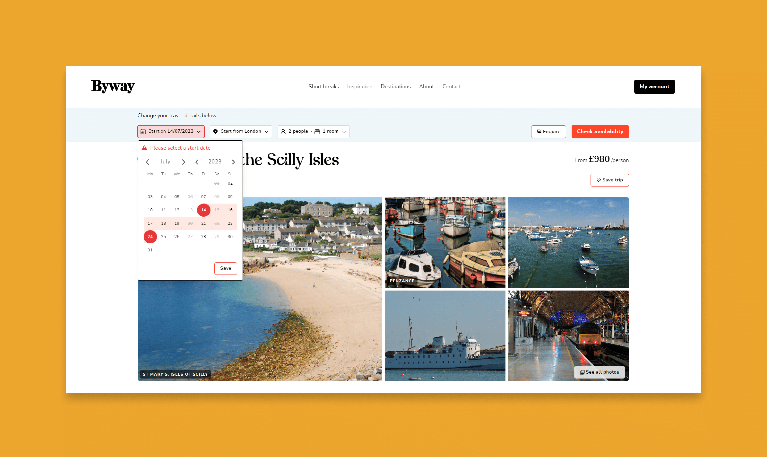
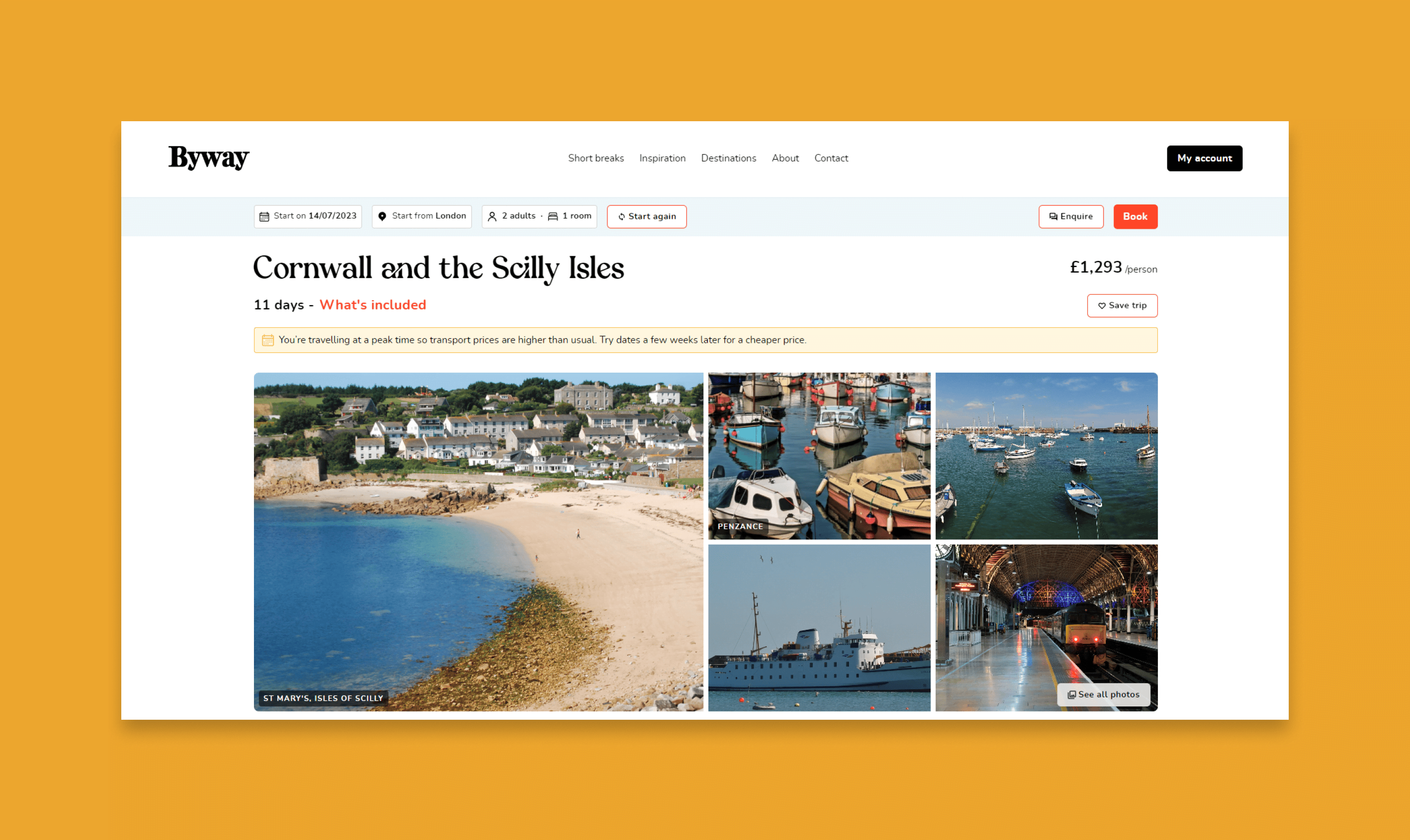
- Language change - Rather than 'Book' the button language was changed to 'Check availability' to both better convey the buttons action and also to encourage clicks from customers as a 'next step action'.
- Automatic display - If any of the select boxes were not valid, they would automatically be displayed with the error message in view for the customers to read and understand.
- Disable invalid dates - A significany change was to disable invalid dates for the trip, this both prevented customer errors and would speed up the decision making process.
- Busy state - A common design heuristic is to always visually show system status to the user, in this case, we showed a 'busy spinner' to customers after clicking on the 'Check availability' button to account for any delay in the response.
Proposed design
Below represents what the trip page top section could have looked like taking into account the improvements mentioned above.

Design improvements
Usability testing
Due to the highly important nature of the problem itself, rapid usability testing was conducted by myself with the staff at Byway. A Prototype was produced and I did a usability test on a one-to-one with each staff member to determine if the solution above was viable. Minor adjustments were made but overall the solution was an overwhelming success.
Below represents the MVP solution that was released to customers.
Results & Final thoughts
Careful monitoring of the feature was carried out once it had been released to live. There was an immense sense of relief once it was quickly identified that customers were able to successfully continue on their path to booking when they needed. There would be other factors at play that would affect conversion, but this was a key area of improvement.
This project was a very valuable experience and a quick demonstration of the value of UX analysis and practice for any organisation. Whilst it's often tempting to always look at the big picture, the customer journey must be considerd at every granular level and equal consideration to each step must be practiced in order to ensure their customer can achieve their goal.